
Finance
What Font Does The IRS Use?
Published: October 31, 2023
Discover the font the IRS uses for its financial documents and forms. Find out how this font choice reflects the importance of finance in tax matters.
(Many of the links in this article redirect to a specific reviewed product. Your purchase of these products through affiliate links helps to generate commission for LiveWell, at no extra cost. Learn more)
Table of Contents
Introduction
The Internal Revenue Service (IRS) is an essential part of the United States government that handles the collection of taxes and enforcement of tax laws. As an authoritative body responsible for financial matters, it is crucial for the IRS to maintain a professional and trustworthy image in all aspects of its operations. One often overlooked aspect of this image is the choice of font used in its official documents.
While some may consider font selection to be an insignificant detail, it plays a significant role in conveying a sense of professionalism and credibility. In official documents such as tax forms, letters, and publications, the font choice not only affects the readability but also influences the overall perception of the content.
In this article, we will explore the importance of font selection in official documents and take a closer look at the specific font used by the IRS. By understanding the characteristics and implications of font choice, we can gain insights into the underlying factors that contribute to the IRS’s communication strategy. Let’s delve into the world of typography and discover what font the IRS uses.
The Importance of Font in Official Documents
When it comes to official documents, font selection holds more significance than one might think. The choice of font can greatly impact how the information is perceived, both visually and subconsciously. Here are a few reasons why font plays a crucial role in official documents:
1. Readability:
The primary purpose of any document is to convey information effectively. The right font can enhance readability, making it easier for readers to comprehend the content. A well-designed font will have the appropriate letter spacing, line height, and proportions, ensuring that the text is legible even at smaller sizes.
2. Professionalism:
The use of a professional-looking font can elevate the overall appearance of official documents. A font with a clean and refined aesthetic gives the impression of attention to detail and expertise. It helps establish a sense of professionalism and credibility, which is particularly important for organizations like the IRS that deal with sensitive financial matters.
3. Consistency:
Consistency in font usage across various documents creates a cohesive visual identity for an organization. When recipients consistently encounter the same font in official correspondence, it fosters familiarity and reinforces the organization’s brand image. It also helps in creating a standardized experience for readers, making it easier for them to navigate and understand the content.
4. Emotional Impact:
Fonts have the power to evoke emotions and convey a certain tone or message. Different fonts possess distinct personalities, such as elegance, stability, or friendliness. By selecting an appropriate font, organizations can effectively communicate their intended message and create a specific atmosphere through their documents.
5. Branding:
Fonts are an essential element of a brand’s identity. The choice of font can align with the organization’s brand voice and values, creating a cohesive brand experience. Consistently using the same font across various materials strengthens brand recognition and helps establish a strong visual presence in the minds of the audience.
Considering all these factors, it becomes evident why font selection is a critical aspect of creating official documents. Now, let’s dive into the font that the IRS specifically uses in its communications.
The Font Used by the Internal Revenue Service (IRS)
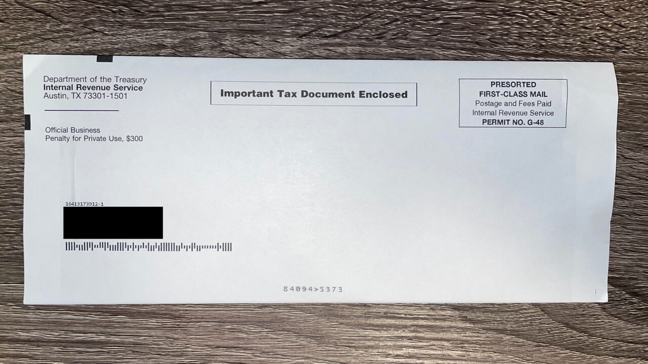
The Internal Revenue Service (IRS) employs a specific font called “Times New Roman” in its official documents. Times New Roman, a widely recognized and commonly used serif font, has been the default font choice for many government agencies and organizations, including the IRS.
The decision to use Times New Roman as the official font aligns with the IRS’s need for clear and legible text. Serif fonts, with their small decorative flourishes at the end of letter strokes, are known for their readability, particularly in printed materials. Times New Roman, with its elegant and timeless appearance, has been a popular choice for official documents due to its readability in both digital and print formats.
Times New Roman features consistent letterforms with moderate spacing between characters. This consistency enhances the clarity of the text, making it easier for readers to navigate through the content and comprehend important information. The font’s uniformity also contributes to the professional and serious tone that is expected from official documents such as tax forms and legal notices.
Additionally, Times New Roman is a widely available font, present on most computers and operating systems. This ensures that the documents created by the IRS can be accessed and viewed by a wide range of individuals without the need for specialized fonts or software.
It is worth noting that while Times New Roman is the default font, the IRS may also use other fonts in certain instances or for specific purposes. For example, in their digital publications, they might utilize sans-serif fonts like Arial or Calibri for a more contemporary and accessible look.
Overall, the choice of Times New Roman as the font for IRS official documents reflects the organization’s commitment to clarity, professionalism, and ease of access. It allows them to effectively communicate important tax information to the public while maintaining a consistent and reliable image.
Analyzing the Characteristics of the IRS Font
Times New Roman, the font used by the Internal Revenue Service (IRS) in its official documents, possesses distinct characteristics that contribute to its usability and visual appeal. By examining these characteristics, we can gain a deeper understanding of the font’s impact on the IRS’s communication strategy.
Serif Typeface:
One of the key characteristics of Times New Roman is its serif design. Serifs are the small decorative flourishes at the end of letter strokes. These serifs help guide the eye along the text, making it easier to read and follow the flow of the content. The use of a serif typeface in official documents enhances legibility and gives a sense of tradition and authority.
Classic and Timeless Appearance:
Times New Roman has a classic and timeless appearance that has stood the test of time. It was designed to resemble the typefaces used in old-style print media, giving it a sense of familiarity and reliability. This traditional aesthetic contributes to the IRS’s goal of projecting a professional and authoritative image.
Optimized Readability:
The proportions and spacing of Times New Roman have been carefully designed to optimize readability. The spacing between characters and lines is generous enough to allow for easy reading, even for longer texts. The letterforms are clear and distinct, ensuring that each character is easily distinguishable.
Legibility in Various Formats:
Times New Roman is a widely recognized and available font, making it suitable for both digital and print formats. The font’s designs are well-suited for high-resolution printing, ensuring clear and legible documents. Its popularity and widespread usage also mean that documents created in Times New Roman can be easily opened and viewed on different devices without compatibility issues.
Consistency and Uniformity:
The consistent letterforms and proportions of Times New Roman contribute to a sense of uniformity throughout the documents. This consistency enhances the IRS’s message and professionalism by providing a cohesive visual experience for the readers.
These characteristics collectively make Times New Roman an excellent choice for the IRS’s official documents. The font’s readability, classic appearance, and versatility across various formats contribute to the effectiveness and accessibility of the IRS’s communication efforts.
Potential Reasons behind the Choice of Font
When it comes to selecting a font for official documents, such as those used by the Internal Revenue Service (IRS), several factors can influence the decision-making process. Here are some potential reasons behind the choice of font for the IRS:
1. Tradition and Familiarity:
Times New Roman has a long-standing history and has been a default font choice for many institutions and organizations, including government agencies, for decades. Its use in official documents creates a sense of tradition and familiarity, which can help establish trust and authority in the eyes of the readers.
2. Readability and Clarity:
The IRS deals with complex tax laws and regulations, and it is essential for their documents to be easily understood by a wide range of individuals. Times New Roman’s serif design and optimized legibility make it an excellent choice for communicating complex information clearly. The font’s letterforms and generous spacing contribute to the readability of the text, ensuring that readers can easily navigate and comprehend the content.
3. Professional Image:
The IRS is responsible for handling important financial matters, and projecting a professional image is paramount. Times New Roman’s classic and timeless appearance exudes a sense of professionalism and seriousness. The font’s use in official documents signals the IRS’s commitment to accuracy, attention to detail, and expertise in their field.
4. Standardization and Consistency:
By using a widely recognized and widely available font like Times New Roman, the IRS ensures consistency and standardization in their documents. Standardized font usage helps create a cohesive visual identity and consistent user experience across different forms, letters, and publications. It also facilitates the efficient processing and understanding of the information by both taxpayers and IRS employees.
5. Compatibility and Accessibility:
Times New Roman’s ubiquity in font libraries and its inclusion in most operating systems make it highly compatible and accessible. Using a font that is widely available ensures that recipients can open and view IRS documents on various devices without the need for additional font downloads or software. This accessibility plays a crucial role in the IRS’s mission of providing accessible and user-friendly information to taxpayers.
While these are potential reasons behind the choice of font, it is important to note that the IRS’s specific reasons may vary based on their internal guidelines and communication objectives. Nevertheless, the selection of Times New Roman aligns with the IRS’s need for readability, professionalism, standardization, and accessibility in their official documents.
Implications of Font Choice in IRS Documents
The font choice in the Internal Revenue Service (IRS) documents has several implications that go beyond just aesthetics. The font selection can influence how the information is perceived, the overall user experience, and even compliance with legal requirements. Here are the implications of font choice in IRS documents:
1. Perceived Credibility and Trustworthiness:
The font choice can contribute to the perceived credibility and trustworthiness of the IRS documents. A professional-looking font like Times New Roman exudes a sense of authority and expertise, which can instill confidence in taxpayers. Conversely, a poorly chosen font may undermine the trust in the information presented, affecting the overall credibility of the IRS and its communications.
2. Compliance with Accessibility Guidelines:
Font selection is crucial in ensuring compliance with accessibility guidelines, such as the Americans with Disabilities Act (ADA). Certain fonts, like Times New Roman, are considered more accessible because they offer better legibility and readability. By using a font that meets these guidelines, the IRS ensures that individuals with visual impairments or reading difficulties can access and understand the information in their documents, promoting inclusivity.
3. Ease of Interpretation:
Clear and legible fonts, like Times New Roman, contribute to the ease of interpretation of IRS documents. The font’s consistent letterforms and well-proportioned spacing make it easier for taxpayers to read and comprehend the information presented. This facilitates accurate interpretation, reducing the likelihood of misinterpretation or misunderstanding that could lead to errors in complying with tax regulations.
4. Consistent Branding and User Experience:
Font consistency across IRS documents helps in building a recognizable brand identity and providing a consistent user experience. When taxpayers encounter the same font in different forms and communication materials, it creates a sense of familiarity and reinforces their trust in the IRS brand. A consistent font choice also aids in navigation and comprehension, as users become accustomed to the visual presentation of the information.
5. Legal Compliance:
The IRS has specific legal requirements regarding the fonts used in official tax forms and publications. Using an approved font ensures compliance with these regulations. Times New Roman, being a widely accepted font, aligns with these requirements and helps the IRS meet its legal obligations in providing accurate and legally compliant information to taxpayers.
Considering these implications, the font choice in IRS documents goes beyond visual aesthetics. It directly impacts credibility, accessibility, interpretation, branding, and legal compliance. By carefully considering the font selection, the IRS can enhance the effectiveness and impact of their communications while ensuring they meet the needs of their diverse audience.
Conclusion
The font choice in official documents, such as those used by the Internal Revenue Service (IRS), plays a significant role in the overall communication strategy and perception of the organization. The use of a specific font like Times New Roman in IRS documents serves several purposes.
Firstly, font selection is essential for enhancing readability and ensuring that the information presented is easily understood. Times New Roman’s legibility and optimized letterforms contribute to clear and comprehensible content, which is crucial for conveying complex tax laws and regulations.
Secondly, font choice impacts the credibility and professionalism associated with the IRS. Times New Roman’s classic and timeless appearance exudes a sense of tradition and authority, instilling trust in the information provided by the IRS.
Furthermore, the choice of Times New Roman aligns with standardization and accessibility requirements. The font’s widespread availability across different platforms and devices ensures that the IRS documents can be accessed and viewed by a wide range of audience without the need for additional font downloads or software.
In conclusion, font selection is not merely a superficial consideration in official documents. It carries implications that influence how the IRS is perceived, the ease of information interpretation, compliance with accessibility guidelines, user experience, and legal obligations. By choosing a font like Times New Roman, the IRS demonstrates their commitment to clear communication, professionalism, and meeting the needs of their diverse audience.
Ultimately, the font choice may seem like a minute detail, but its impact is significant in shaping the effectiveness and reception of the IRS’s communication efforts. By paying attention to the choice of font, the IRS ensures that their official documents convey the necessary information accurately, fosters trust, and reinforces their credibility as a trusted financial institution.
What's Hot
Latest Articles
Related Post

By: • Finance

By: • Finance

By: • Finance

By: • Finance
By: • Finance
By: • Finance
By: • Finance

By: • Finance

By: • Finance
By: • Finance


By: • Finance


By: • Finance

By: • Finance